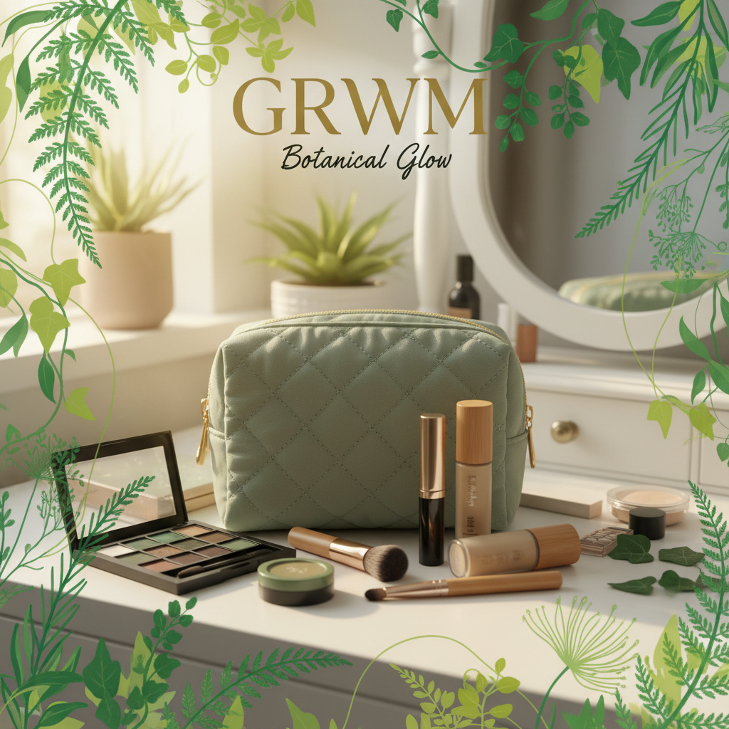
The Template Drop Your Profile Page Has Been Waiting For
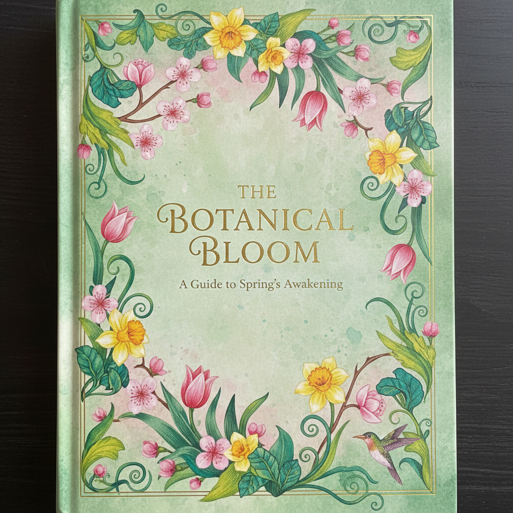
Spring Editorial
Botanical Typography · Soft Grain · Pastel Ink on Black
There is a particular quality of light in April — diffuse, unhurried, the color of first leaves through frosted glass. This collection was built inside that feeling. Each cover is a typographic still life, the kind that makes a viewer pause mid-scroll and wonder who made this.
Condensed serif headlines paired with micro-weight body text. Wide tracking on all caps labels creates negative space that breathes.
Cottagecore's evolved successor — botanical aesthetics meeting editorial authority. For the creator whose content feels like a magazine you'd actually buy.
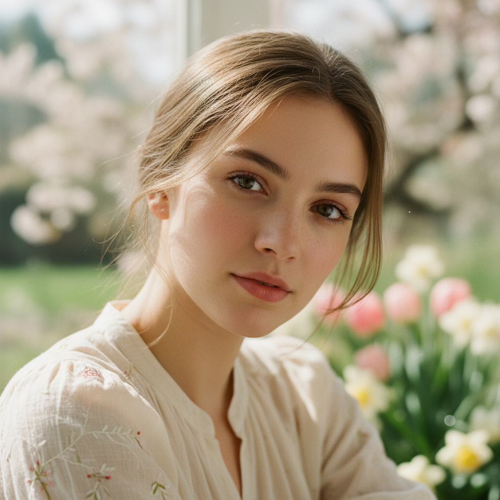
@sofiavarela
Highlights


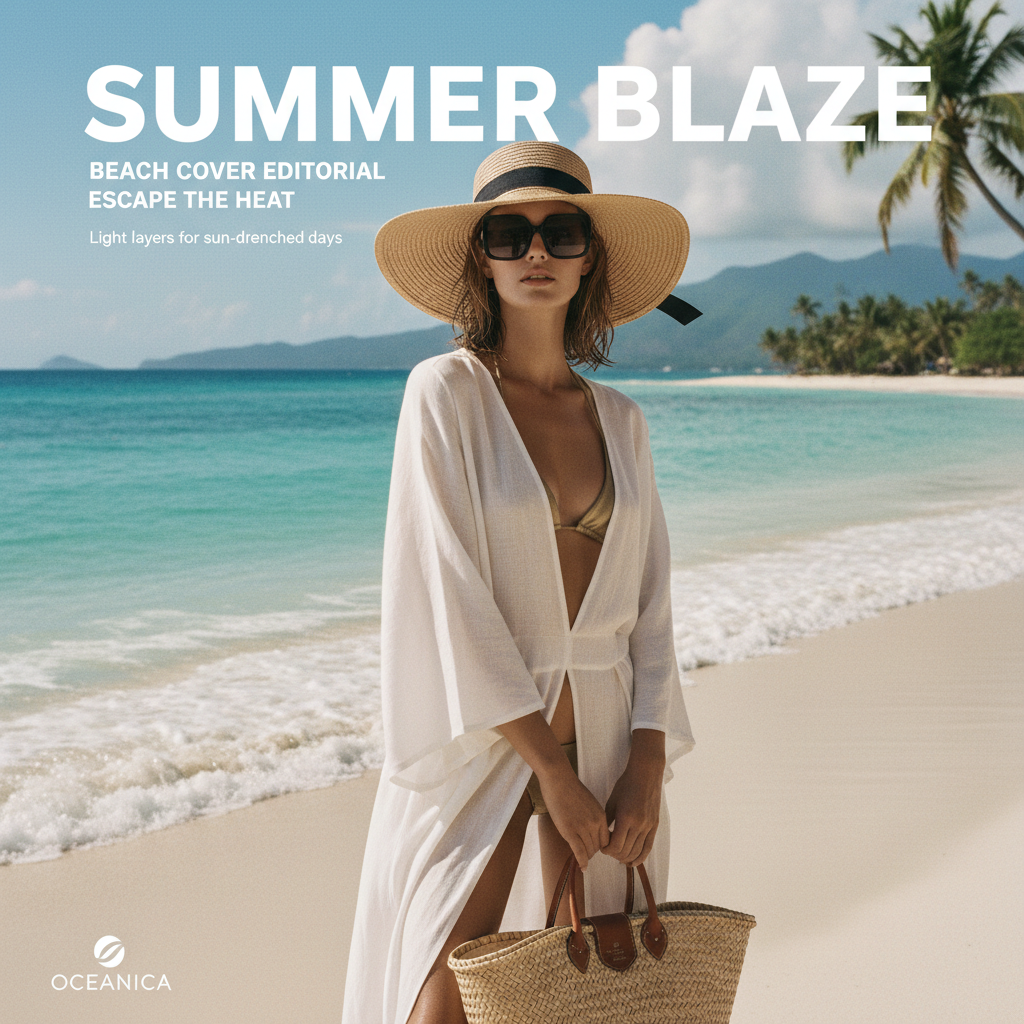
Summer Heat
Saturated Contrast · Overexposed Crops · Heat Distortion Type
Summer content is a war for attention in a saturated feed. This collection doesn't ask for attention — it demands it. High contrast, almost aggressive crops, type set at sizes that feel illegal. The aesthetic of a creator who has stopped asking permission.
Ultra-bold display type at maximum weight. Overexposed photograph treatments create near-white backgrounds that make dark type explode off the screen.
Deinfluencing gave way to hyper-curation. Summer Heat is for the creator who curates like a magazine art director — every cover a considered editorial decision.
@marcuswells
Highlights
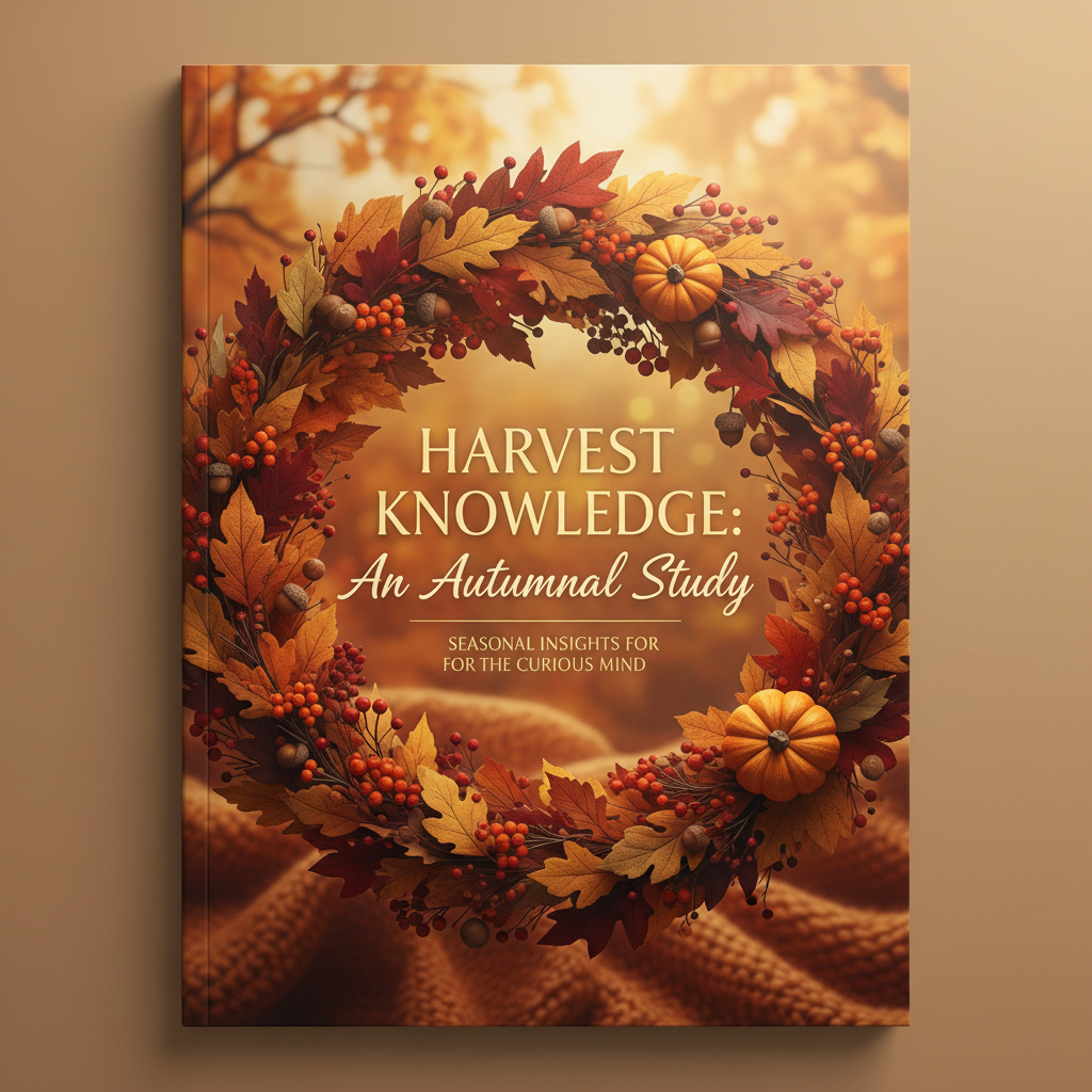
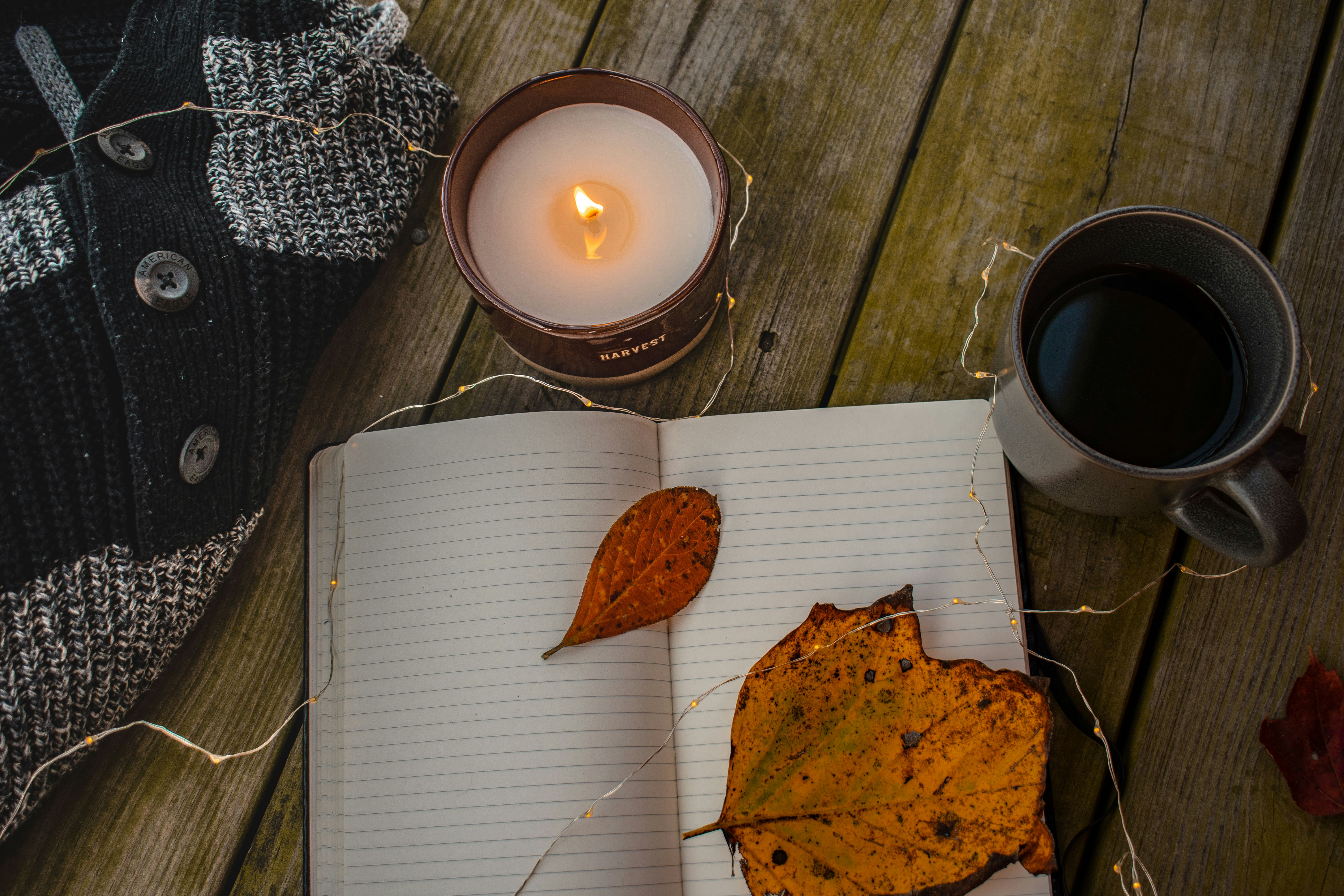
Autumn Study
Warm Grain · Academic Serif · Amber Ink · Bookshelf Tone
October is the month when TikTok becomes a library. Study-with-me content peaks, aesthetic desks trend, and the feed turns amber. Autumn Study was designed for the creator whose content asks viewers to slow down — and whose profile should feel like a shelf of beautiful books you haven't read yet.
Old-style serif with high x-height. Tracking pushed to near-illegible on labels, then pulled back to readable on body. The tension is the point.
Dark academia never left — it evolved. Autumn Study sits at the intersection of studygram discipline and TikTok's appetite for cozy aspiration. For the creator who makes viewers want to be more.

@priyankachandra
Highlights

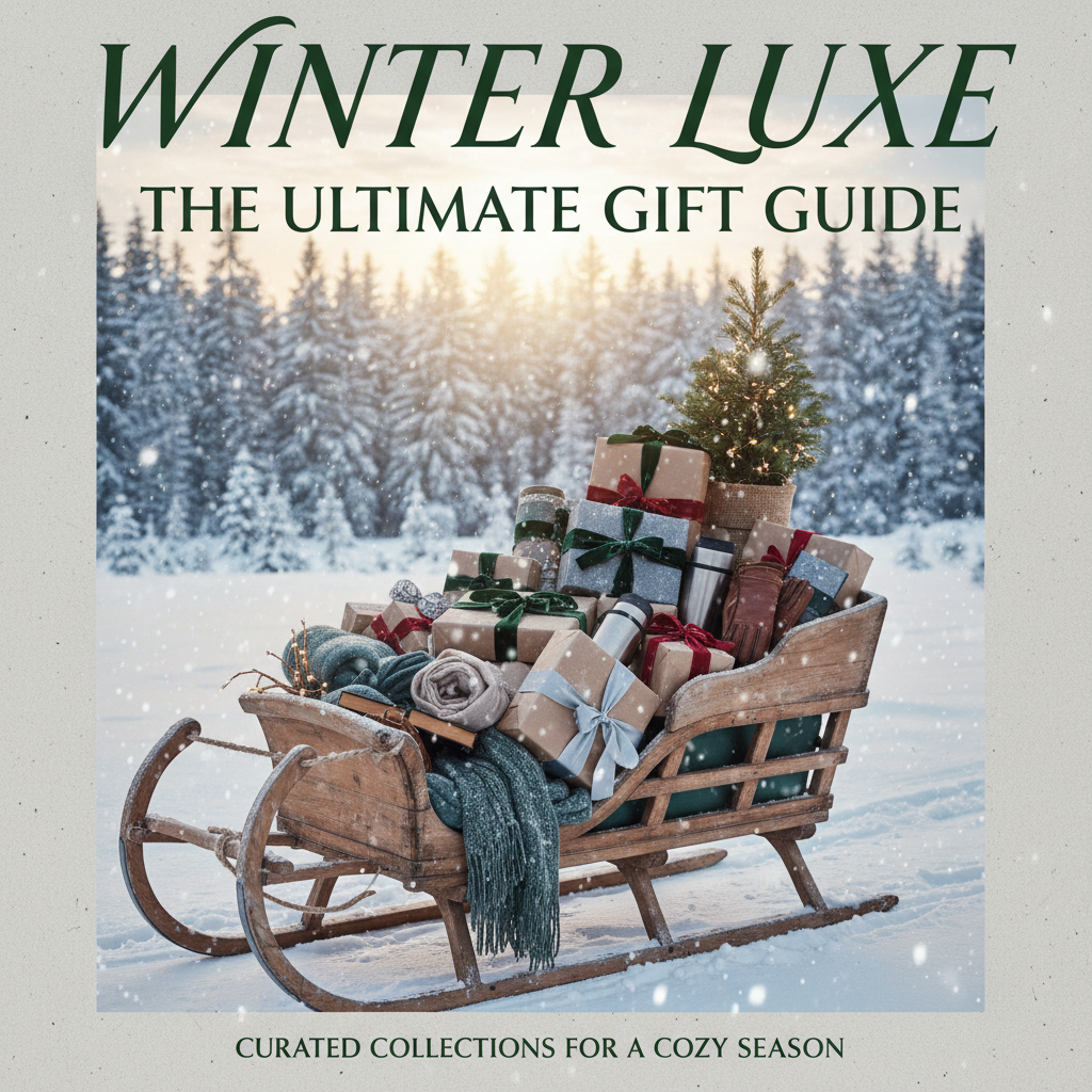
Winter Glow
Ice Grain · Spectral Violet · Glacial Serif · Frost Typography
The last collection of the year should feel like the last page of a journal you've been afraid to finish. Winter Glow is built for the creator who understands that restraint is the ultimate flex — covers so composed they make viewers stop scrolling just to ask: who made this?
Thin-weight condensed serif at enormous scale. Violet and glacial mist on near-black — the palette of ink on frosted glass. Deliberate, unhurried, impossibly composed.
Holiday content oversaturation created an opening for the anti-holiday aesthetic. Winter Glow is for creators who build an atmosphere — not a mood board.
@jademorrissey
Highlights
Reserve My Drop
First access. No public launch. The drop goes to the waitlist only — and spots are genuinely limited.